Editorial & Illustration"Let's Learn About Cancer"
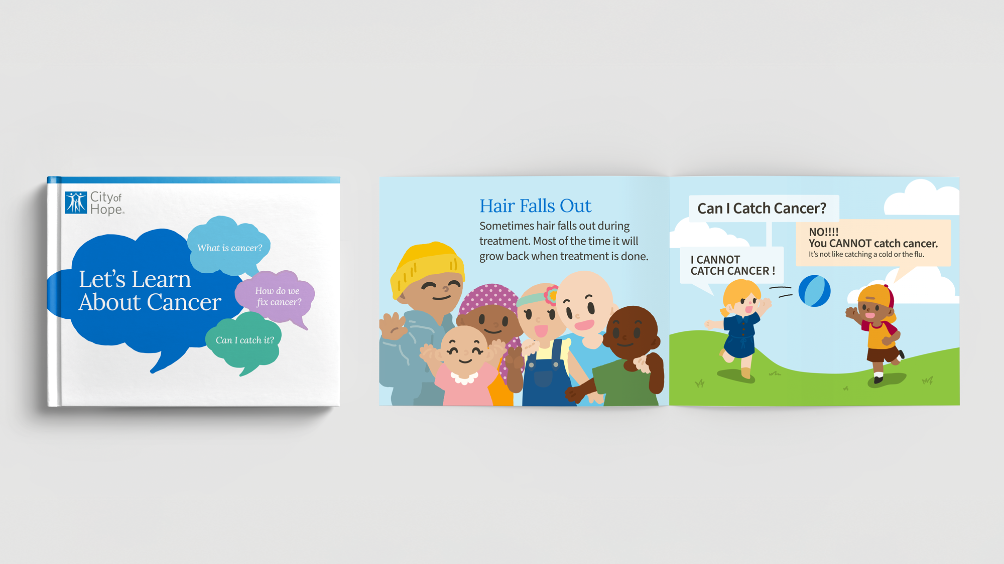
As a In-House Designer for a leading national oncology network, I led the end-to-end editorial and illustration strategy for a 16-page pediatric educational book. My goal was to translate complex medical procedures like chemotherapy and radiation into an approachable visual language, utilizing interactive elements to help young patients process and express their emotions.
Tools
Illustrator, Procreate
Role
Graphic Designer II
Team
Creative Director
Internal Departments
Task: My job was to take dense clinical copy and redesign it into a 16-page book that was friendly, educational, and interactive.
Challenge: The primary challenge was taking straightforward, medically dense copy and translating it into illustrations that are clear and non-threatening for children.
Action
Visual Translation: I simplified complex biology into clear illustrations, using friendly characters to explain how cells grow and how medical treatments work
Information Design: I utilized high-contrast headers and simple iconography to explain side effects like "Fever," "Nausea," and "Hair Loss" .
Interactive Strategy: I designed a "What Kind of Cell am I?" spread that invites children to personalize the book by coloring in their current "cell" and identifying their emotions, such as "Happy," "Mad," "Sad," "Worried," or "Calm" .
Editorial Layout: I structured the content to address common fears—like "Can I catch it?" or "Did I cause it?"—with immediate, clear visual answers .
Result
Produced a professional in-house resource that empowers patients to understand their health and express their feelings through art therapy .
-
![]()
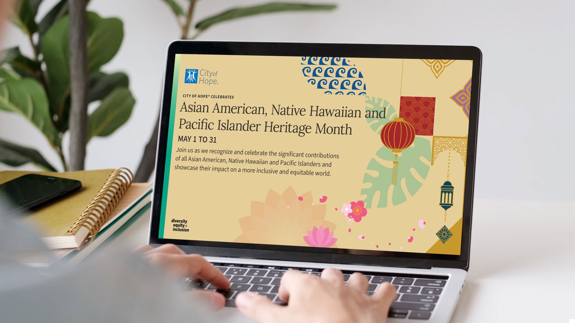
City of Hope: Observances Creative Suite | Multi-Channel Design
-
![]()
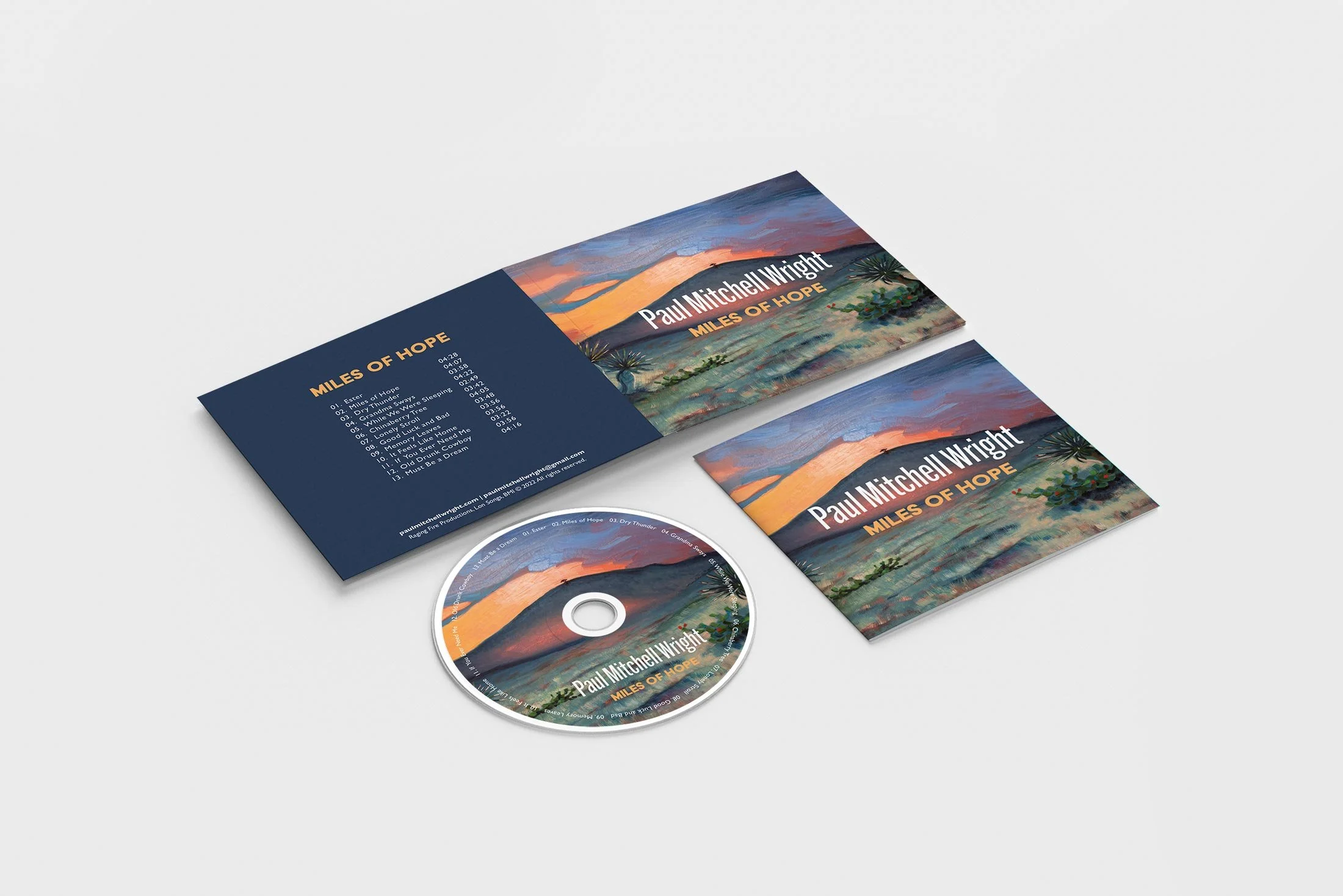
"Miles of Hope" | Editorial & Packaging Design
-
![]()
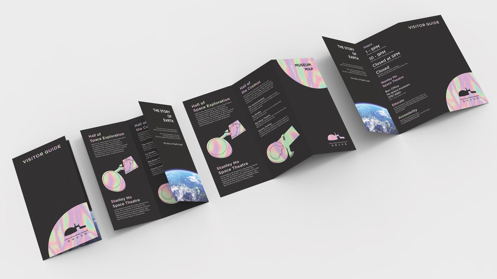
Hong Kong Space Museum | Brand Identity & Print Concept