Integrated Campaign & Brand IdentityNational Doctors Day
Tools
Illustrator, Photoshop, InDesign
Role
Graphic Designer II
Team
Creative Director
Internal Departments
Junior designer
Task: Managed project from concept to final delivery, starting with a custom "Doctors Day" lockup to anchor the new look.
Challenge: In the past, Doctors Day was a major logistical hurdle because every hospital location insisted on featuring its own specific physicians. Managing that volume of photos over the last two years made it impossible to stay efficient or maintain a consistent brand voice.
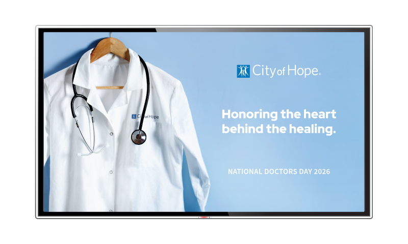
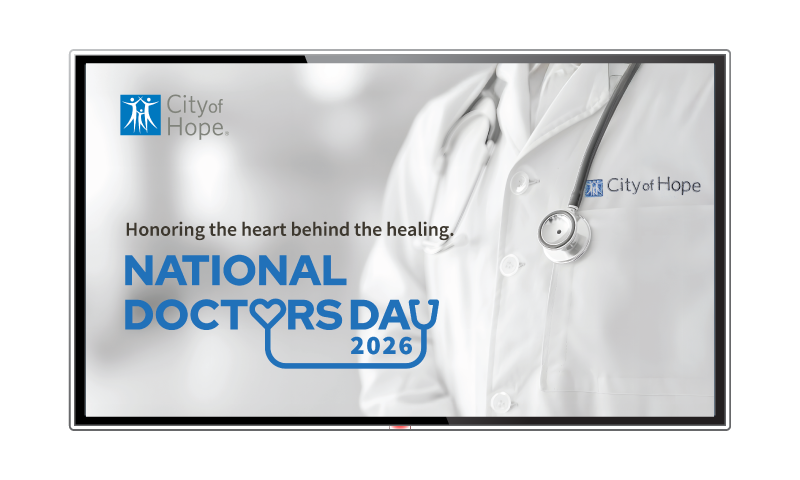
Initial Concept
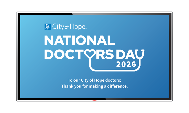
The primary goal was to shift the visual focus from individual photography to a central thank-you message. By using the white coat as a universal symbol for all physicians, the campaign achieved a clean, professional aesthetic without the need for portraits. This approach ensured a broad, respectful, and on-brand expression of appreciation across all locations.
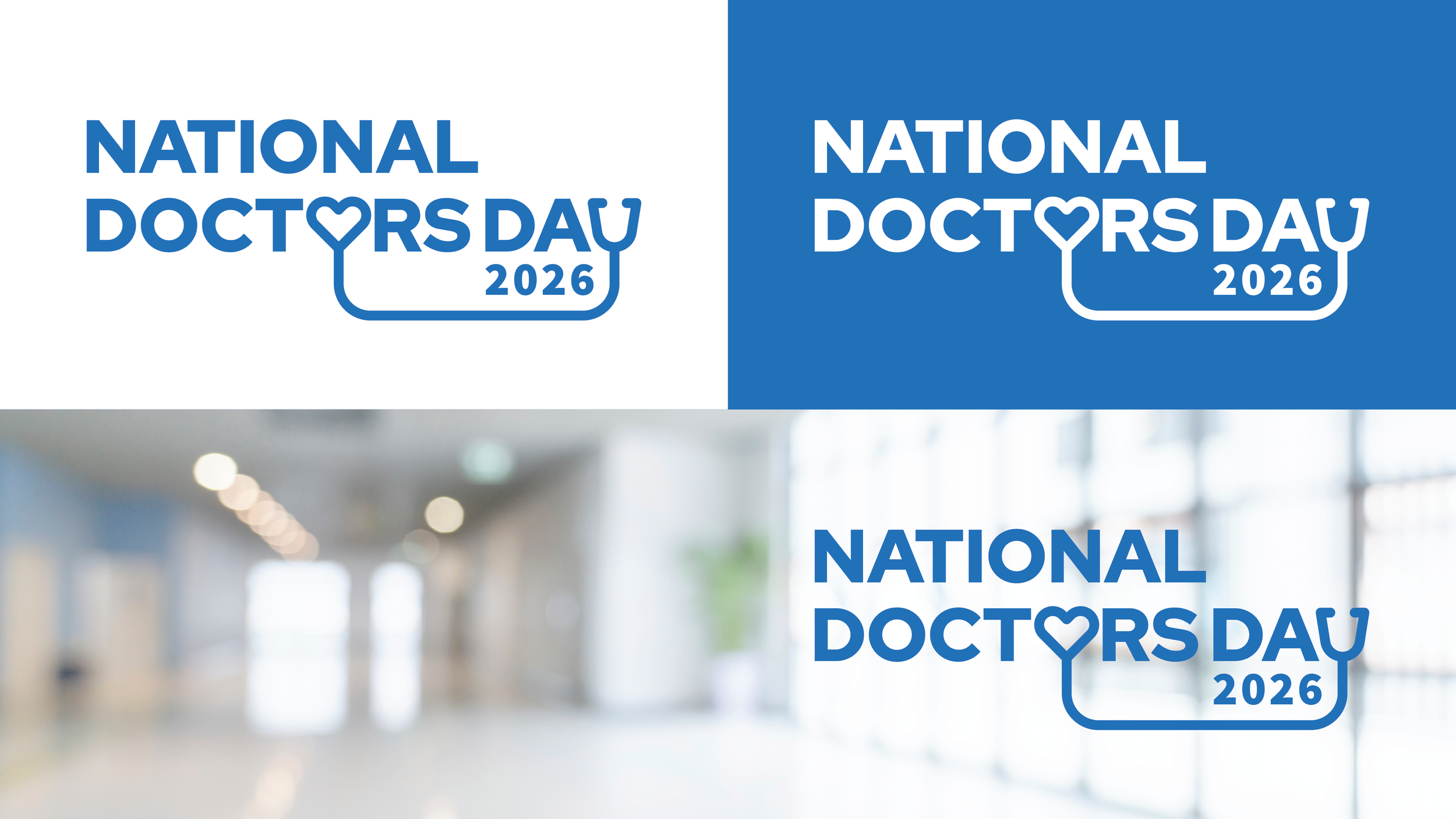
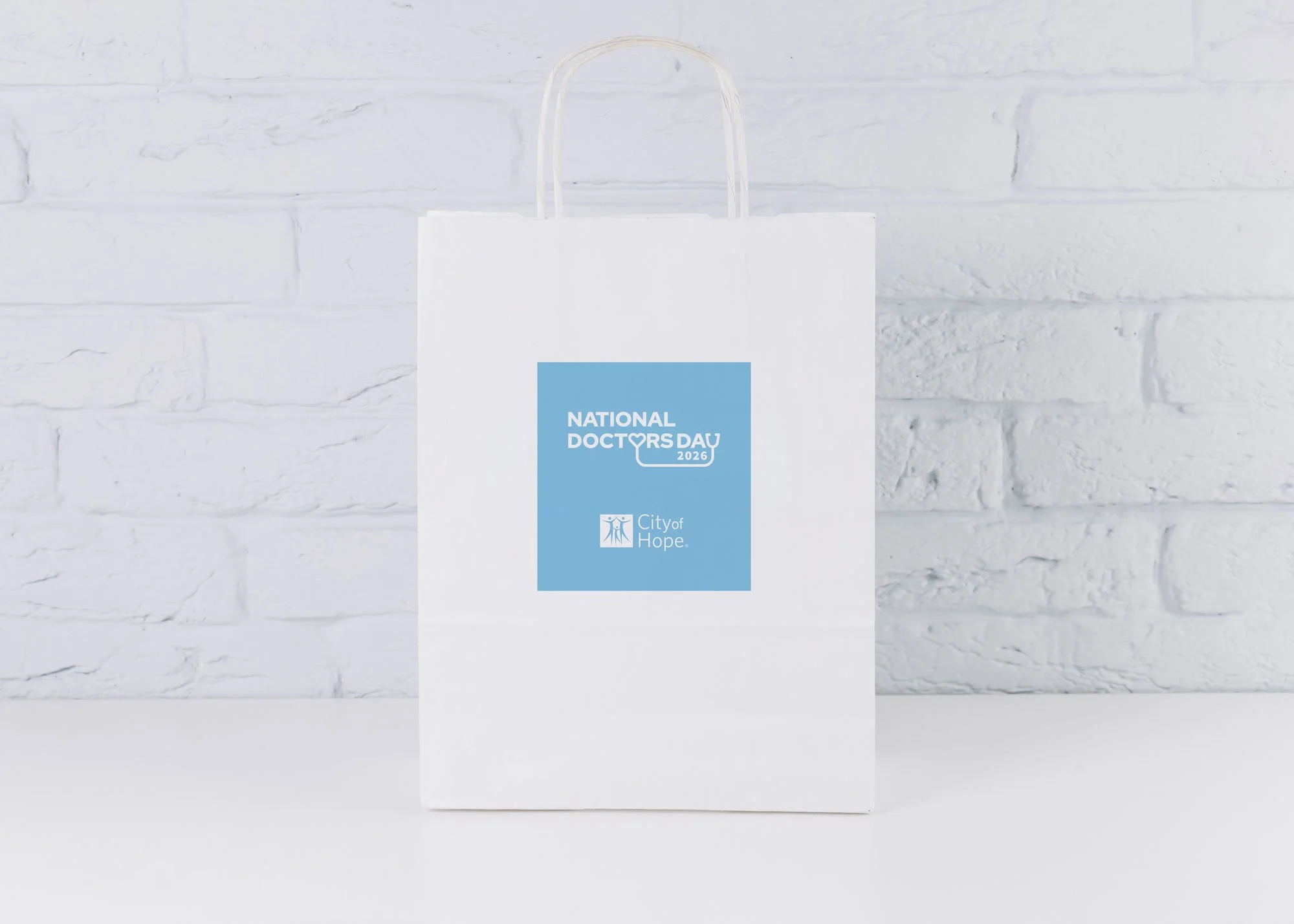
A custom lockup was developed for Doctors Day, combining a stethoscope and heart shape to emphasize the message of appreciation. The iconography was integrated into the letters 'O' and 'Y' using brand-standard typography to ensure institutional alignment. Designed for longevity, the lockup serves as an evergreen asset for future annual observances.
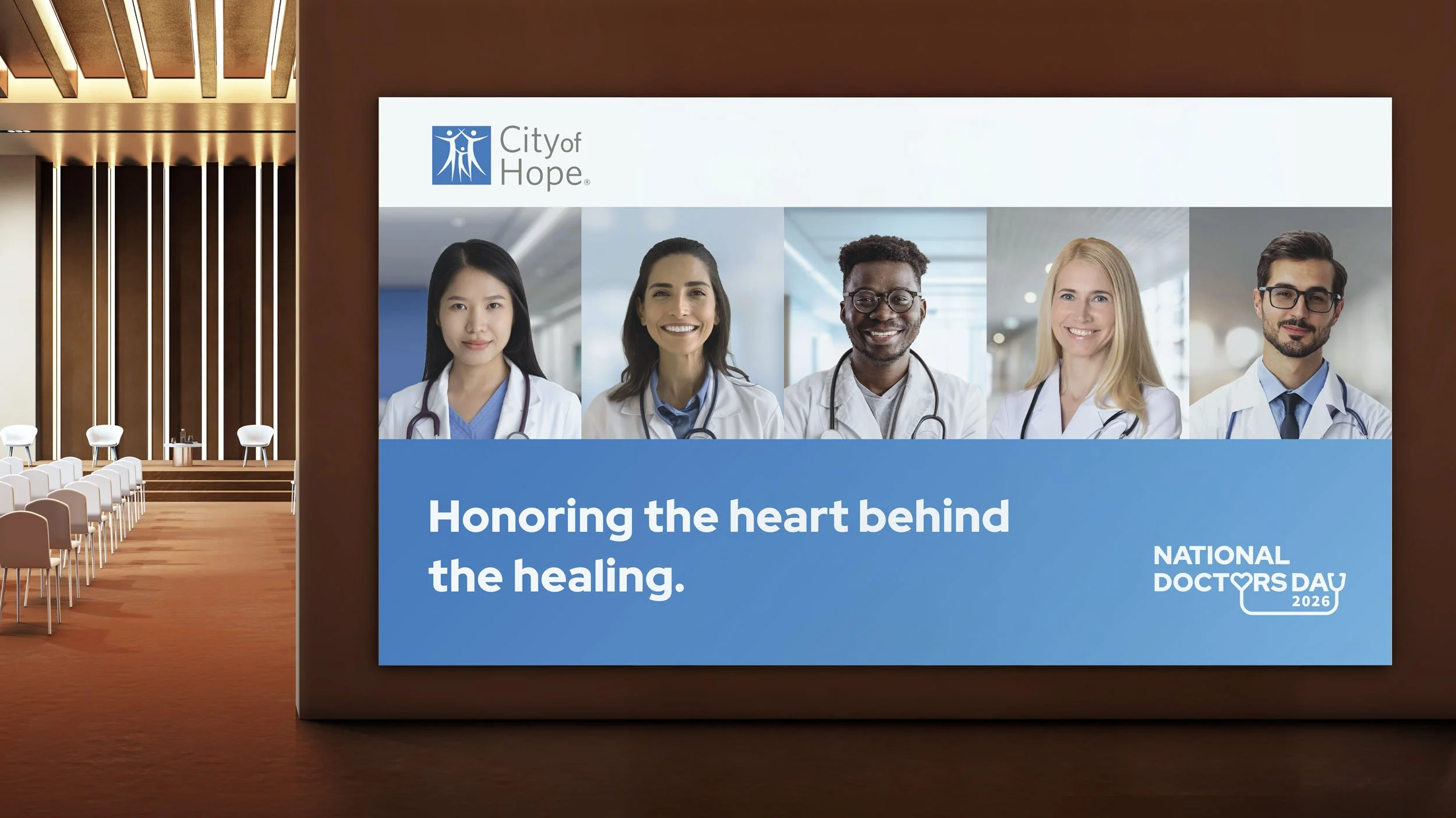
Final Delivery
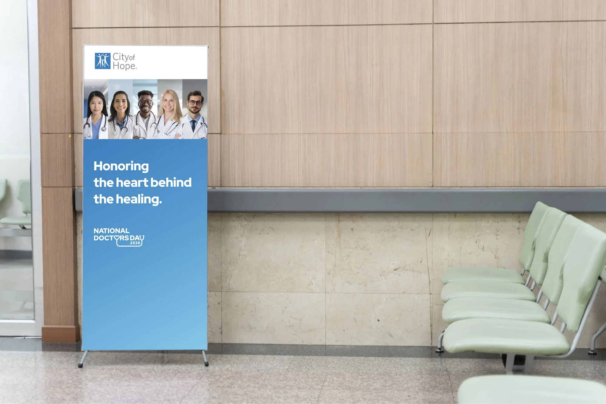
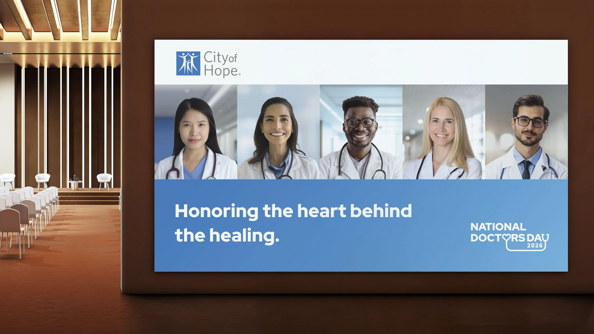
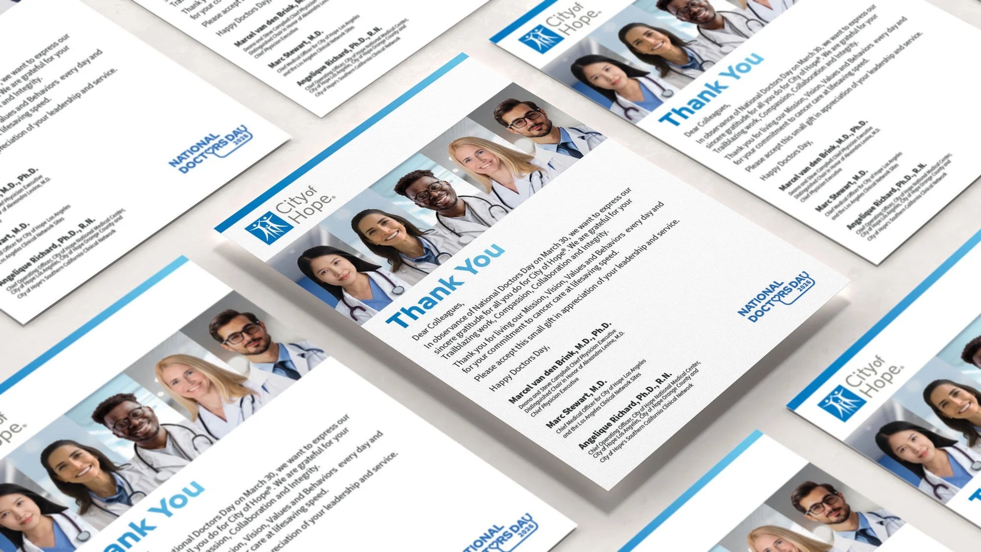
Consultation with physician representatives provided key insights into the importance of using portraits for personal connection. Following this collaborative discussion, the final concept was adapted to include physician portraits set against clinical backgrounds, specifically selected to ensure efficient masking and production speed. By maintaining a minimalist editorial layout, the design incorporates photography while ensuring the message of appreciation remains the primary focal point.